LOGO DESIGN | BRAND IDENTITY | STATIONERY
……………………
"Quby's rebranding was motivated by the ambition to transition from a small, rather introspective technical company, towards a leader in the market of smart thermostats and home energy management.
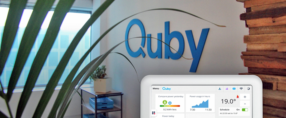
Paul understood what was needed to support the transition of the company and tackled this admirably. The redesign of the Quby logo was a symbol of that transition. It is an evolution of the dashed, playful logo into a no-frills, solid and bold shape; ready to do business.
With a slight reference to the original logo, building upon the existing good reputation of Quby yet expressing more confidence and authority, looking forward rather than being nostalgic. I think everyone at Quby felt that we were stepping up our game, the new identity was something the entire staff could take pride in.
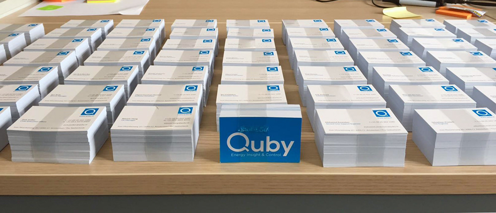
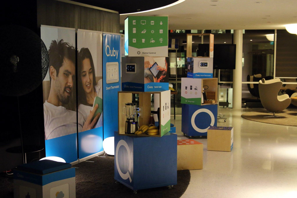
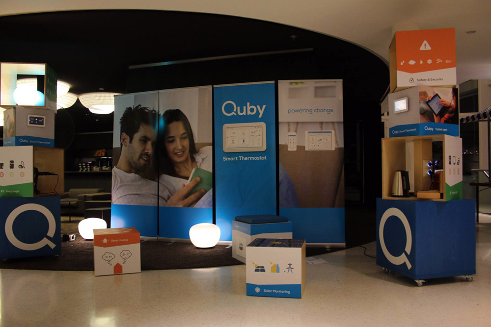
Besides the logo, Paul has designed various assets of the brand identity and defined a basic house style that is workable and has ensured a strong and consistent appearance of the company.
The Logo design and brand identity provided by Paul has also helped shape the way external partners and clients now perceive Quby: an innovative and reliable partner. It has been an important part in the development of Quby's expert status."
Linda Inpijn - Marketing Communicatie Specialist